Beckham stated that with her S/S15 collection, she "wanted something minimal and graphic with a slightly raw element" which is evident through the predominantly solid colours, using mainly taupe, burgandy, black and white (which were my favourite looks), clean silhouettes, low V necks and lots of double-breasted jackets and dresses. Another predominant feature within the collection was the below-the-knee hemlines which occurred on 26 looks out of her 32 outfit collection, elongating the looks.
Beckham ended the show with a few surprises, bringing out the colourful bright yellow and pink floral prints that no one expected to see. As Miranda Priestly, in The Devil Wears Prada, says "Florals? For Spring? Ground Breaking"... however Beckham changes up the usual floral collection by abstracting the print and silk printing onto raffia, creating a pantsuit, a casual short shirt dress and belted skirts. Mixing it with military-inspired epaulets and pocketed shirts
Also, congrats to VB for also introducing her very first shoe collection.


Public School
Maxwell Osborne and Dao-Yi, the designer duo who make up Public School continued what seems to be a huge trend for S/S15 - monochromatic sports-inspired urban chic with their collection at NYFW. These designers have kicked up a lot of attention at CFDA and it is clear why in this collection. The collection predominantly uses geometric blocks of black and white patterns and layering of tailored blazers, armour-looking vests, oversized shirts and bomber jackets which makes the female's look very masculine, only exaggerated by shoulder pads, but also femininity shines through with the use of skater skirts, ruffles at hems and jumpers that clinch in at the waist.
A hint of blue and grey also breaks up the mostly black and white collection with the powerful abstract blue and black print on some of the female's more sophisticated white pieces.


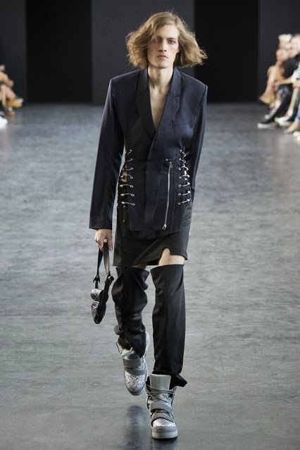
Hood by Air
Well this show was a bit controversial with the solid transparent plastic collars worn around the models' necks and occasionally around the wrist, giving a restrictive, limited movement affect and an up-to-date twist to the traditional stock's. These interesting accessories make the audience question, "what is the meaning behind them?". Especially since, according to one source, Shayne Oliver, the designer for HBA, is "more interested in self-expression as a means of challenging norms than he is in conventional forms of protest. Institutional oppression isn't his thing." Oliver stated that the principal theme of his show was "an interrogation of what it means to be a man" thus the deconstruction and reconstruction of blazers, suits, shirts and trousers. Largely pushing the boundaries of self-image, sexuality and society issues, Hood By Air impressed a broad audience.
The collection was also very wearable with leather bombers, white shirts, printed tees and long-time on trend distressed denim that were also painted, zippered and shredded with the embossed leather "HBA" logo plastered on the knee caps.


Porsche Design
Thomas Steinbrueck's eye for detail really perfected this minimalist collection. As you can probably tell by now, if you read my blog, I'm a minimalist-enthusiast so I loved this clean, sharp collection which encourages long silhouettes and deep, plunging V necklines adding elegance to the texture mixing collection. He used fabrics that one wouldn't usually expect for such classic designs and transformed them technically for his preferred use, such as trenches in a soft latex and linen-textured fabric for trousers and jackets.
Unlike most designers, Steinbrueck uses a darker palette for his daywear and a lighter palette for his nightwear and the tailoring was divine.
I want the majority of these pieces but that latex trench is cool as hell.


Tim Coppens
Most of the articles you may have read on Tim Coppens being with the same quote... one from Ian Brown which goes "When your halo slips for good, you'll have to wear your hood" because he had written it in his notes for Sunday's runway show. Many of the pieces he created included a hood but what stood out more to me was his key use of a natural palette, using black, navy, limestone and white whilst exciting his audience with vibrant outerwear such as oversized bombers and parkers.
Backstage, he stated that his inspiration for Spring were "part Brown, part papery sleeves used to protect vinyl records when they're slipped into album covers, and part Manchester football fans who used to wear trench coats".
Gotta get my hands on that colourful bomber jacket dress.


Diane Von Furstenberg
Such a happy looking collection. Diane Von Furstenberg's inspiration for this collection was the 1950s French Riviera and the beautiful Brigitte Bardot. My favourite pieces were the gingham print, especially the garments which mix the sizing of prints and the items of clothing with the vibrant splashes of colour printed on them too. Other than that, the collection is full of bright floral playsuits and suits. However, I definitely think gingham is the winner in this collection as Furstenberg aces it.


Versus Versace
Belgian born designer Anthony Vaccarello revealed his capsule collection in collaboration with Versace on Sunday and although expectations were high, due to great previous collabs, he didn't disappoint. Versus' signature lion's head logos appeared throughout the whole collection on basically every piece and the infamous Versace cut outs and clean cut tailoring stayed in tact. Vaccarello stated that he sees the Versus girl as "urban and pays attention to details. It's based on my memories of the original Versus collections that I loved."
I absolutely adore the black and white print and it must be said that, without exception, my favourite piece from the collection was the shirt dress with the gorgeous print on it.


(all photos from Vogue.co.uk)
G xxx
No comments:
Post a Comment