Antonio Azzuolo
*I was told after this post that Azzuolo's presentation was actually on the 3rd of September. I apologise for the incorrect-ness of this bit of my post. Nonetheless, this collection is incredible, so it's staying!*
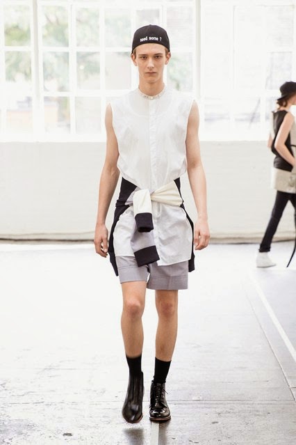
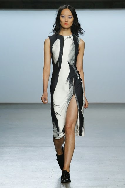
As with Chai's runway on Thursday, Azzuolo's men's collection and women's collection was presented alongside each other because they complimented each other so damn well. With masculine clothing, the female collection gives off an androgynous feel whilst creating new silhouettes with lengthy layering. I'm absolutely in love with the monochrome women's garments and the mixing of printed fabric on both collections work well together. The whole collection has a laid back preppy rebel feel to it.
Gotta get my hands on the long monochrome shirt, the black waistcoat, the culottes ... and of course that anorak (I die).
Wes Gordon
Sleek and simple. Gordon, the 2012 CFDA/Vogue Fashion Fund finalist, takes minimalist fashion to a new level in this collection. According to an interview, Gordon said that he "wanted a tranquil collection, a dialogue between femininity and softness and something romantic, and also clean, crisp, modern, streamlined silhouettes" and that is, absolutely, the most perfect way to describe it. He takes a rather neutral colour palette, inspired by dawn, using "soft celadons, blues and blushes with black, optic white and camel grounding it" and compliments them with simple but effective designs which he some how manages to make his own. I love the sleek low V cuts he uses on the otherwise clean and simple wrap dress
As I watched this runway show, I couldn't help thinking to myself "I'd wear that", "I'd wear that"... to every single piece. Beware, come Spring, you might find your bank balance rapidly decreasing.
Wu, the Taiwanese-Canadian designer, focused his collection on the concept of "strong women" and wanted to celebrate women and rightly so, as all these models look like they're READY for business. As I stated in my last post, I'm a huge advocate for varying dress lengths and with some of the bottom of the garment is either just above the knee, at the knee, floor length etc it is clear that Monique Lhuillier tried out the different lengths for different effects.
According to Lhuillier, "Spring is all about lightness. I wanted it to be bright, reflective, shimmering, luminous, that is what you are seeing here today" which reflects extremely well in the evening wear with the metallic materials and the beads and sequins used, and even with the array of colours specifically chosen for this collection - umber, white, olive, teal, various blues and bright red. There was also the strong use of black and navy as well as lace.
I was a huge fan of the abstract, subtle camo print that captured the eye for the first few looks. The first look was perhaps my favourite(see below) as the same print is used but on different fabrics and then they are layered on top of each other exaggerating the importance for textures.
Plunging V's, wrap skirts which reveal a lotta thigh, see-through lace, classy, floaty silk dresses with deep plunged necks and camo print is in this Spring according to Wu.
Zimmermann
Nicky Zimmermann, an Australian designer, gave her collection a romantic gypsy vibe with an odd twist, inspired by "a tarot care [they] saw by David Palladini in 1969". She says that "from there, [they] played around with metallic colours and gemstones. [They] wanted the collection to be airy and fresh". Excessive use of transparent lace, frills and ruffles in a range of prints and colours made an exciting S/S 15 collection. The collection was very feminine for the most part but then occasionally she would surprise the audience by adding another layer which looked to be a boxy, oversized sleeveless military or safari jacket which ties and clinched in the waist (to keep the feminine feel) which also allows the overload of frills to actually spill out of the jacket and make an appearance, keeping the romantic edge alive.
Another thing I loved was the unusual shoulder/neck area. To me, the dress looks like it's about to fall of the model due to the thin spaghetti strap on the left shoulder with an additional off-shoulder sleeve whilst the sleeve on the right shoulder sits normally. It looks kind of risque but I like the asymmetrical-ness of it.
Apart from the to-die-for first look that walked down the cat walk that I instantly fell in love with, my favourite pieces were that metallic suit and the swim wear (you can see here).
Tess Giberson
Giberson claimed that her collection, named "Simulate", is her "vision of Palm Springs" and that she was stimulated by the juxtaposition of the "water environments in a desert landscape" and so she proceeded to mix man-made and natural materials together in the garments for example, on the runway she presents a crochet metallic dress.
Her key colour in this collection was white, but silver, black and a mixture of blues were also featured. The all white outfits were my favourite by far because they looked so sleek and clean cut but I did adore the pastel, sky blue jumpsuit and the transition from white to blue and then the abstract prints which were a mixture of them both and tied the colours nicely together. To really push the idea of Palm Springs, she also included some swimwear, worn with transparent cover-ups.
Cushnie et Ochs
I've left my 2 absolute favourite collections of the day until last. Carly Cushnie and Michelle Ochs really have put the wow-factor into this collection. I think I'd feel sexy in any of the looks that went down that runway and whether you're into bulky cut-outs or fragile and delicate spaghetti straps as an extra detail, there really is something for everyone. What I love is that every single piece has a little bit of skin on show and hugs the body, but every single one looks sophisticated.
This collection was created to look part goddess, part warrior (apparent through the fringing and draping).
The colours are probably what stood out the most to me. That marigold on the opening few pieces was show stopping, and that is when I just knew this collection was going for gold. The rest of the looks did not disappoint. A collection of fabulous teal (my favourite colour) dresses next took the limelight followed by a pale pink.
The show stopped on the timeless black pieces which absolutely killed it!
I can't give you my favourite piece... I love them all.
Sally Lapointe
Lapointe's predominantly monochrome collection had everything I love about fashion mixed up into the same collection. The mixing of textures, the perfect tailoring, the creation of new silhouettes, the androgynous, the playing with the length of dress, lengthy layering, abstract prints... you name it. I literally can't fault this collection, just look at it *cries inside*.
Sally Lapointe stated that it was the "idea of spring cleaning" that inspired this draw dropping collection. "Stripping away" of all the fancy embellishments and "streamlining" allows her to create "confidence and certainty". In an interview with Lapointe, she said that the collection was "like, an overall cleanse or palette cleanser - a fresh start. It was about focusing on having less and lessing things stand for themselves".
In this collection, I feel like less certainly is more, creating a laid back, easy to wear yet chic and edgy statement collection.
(all photos courtesy of Vogue.co.uk)
G xxx


No comments:
Post a Comment